# Asahi Style Guide
Style guide for web applications across all brands of Asahi Group Holdings, Ltd.
This is the first initial version of this style guide. This style guide is currently tailored solely to Plzeňský Prazdroj brand only. In the future, it is planned to expand this style guide for other Asahi brands.
# Purpose of this Style Guide
Style Guide definition - a style guide is a document of code standards that details the various elements and patterns of a site or application.
Style Guide general goals - the purpose of the Asahi style guide is to keep consistent and high-quality user experience across the whole family of web applications.
How and why this style guide was created
- This style guide was created by MIBCON a.s., the author of the Prazdroj Customer Portal web application.
- Customer Portal is a web application for Prazdroj's customers that provides its own functionality such as
- Overview of customers' premises (supply points)
- Overview of customers sales orders
- Access to latest news (articles) created and administered by Plzeňský Prazdroj
- Along with the above functionality, Customer Portal serves as a gateway to other Plzeňský Prazdroj web applications and services created for Plzeňský Prazdroj's customers.
What this style guide currently contains
This style guide contains description of rules and design principles of basic UI components used on Customer Portal, which must be used in other applications / services integrated into Customer Portal. Branding is now prepared only for Plzeňský Prazdroj - other Asahi brands should be added in the future.
Style guide current goals
- In this current version, this style guide aims to provide set of principles that will allow the keeping of consistent and high-quality user experience for all applications integrated into Prazdroj Customer Portal.
- The ultimate and main goal is to ensure that all applications and services integrated into Customer Portal will have a uniform design and user controls.
- When browsing Customer Portal and its integrated applications and services, the user should not be aware of switching between the applications / services.
- It is essential that all Plzeňský Prazdroj web applications and services integrated into Customer Portal implement the principles, rules and technologies contained in this style guide to ensure uniform design and user controls for all users of applications / services integrated into Customer Portal.
# Rules of development new customer web apps
To ensure the uniform design of all customer facing application in Plzeňský Prazdroj - all new web applications/services must follow this style guide - this means uniform design, layout and navigation and be integrated with Customer Portal.
- You have to use the prepared design assets in this style guide for your application's design (if a component is not present in. the styleguide you can create your own with matching design language)
- You have to prepare mobile and desktop version of all components (responsive design - ideally mobile first approach)
- Develop the them using your own technologies or alternatively use one of the ready made web components.
- Integrate your application in the Customer Portal using:
- Use the web component Chrome - this component covers the whole layout of the application with navigation. This web component will cover a big part ofthe design.
- The content of your application will be integrated into Customer Portal via an iframe. * Implement layout and navigation using your technologies, but the design must be exactly the same as on Customer Portal (ie as web component Chrome). However, the web component will not be used.
- Provide an API in your application, in which case Customer Portal will handle all the design and will only use data from your application via the API.
# Style Guide for Plzeňský Prazdroj (CZ/SK)
At the moment, there is only a style guide for Plzeňský Prazdroj brand. In the future we expect to have there style guides for multiple brands within European region.
You can download the Style Guide for Plzeňský Prazdroj Brand here:
We have created the style guide in two major UI design tools: Figma and Sketch. They have a combined market share over 75%, so they are hopefully what your designers use. In other cases, we recommend using Figma, which has a free version. Also, other minor tools usually have an import option from one of these file formats. There is also a PDF download for your convenience. Just in case you need something fast for business meeting or you don't have designer tool available.
Customer Portal Design as inspiration
To get a better feel about how to align your design with the Prazdroj app ecosystem, you can check the Customer Portal Design with all the screen examples - customer screens and admin screen both in desktop and mobile version.
https://www.figma.com/file/BB2zy9SEA3hIeC76cirALr/Prazdroj-Customer-Portal?node-id=0%3A1
# Style Guide for other Asahi brands
There are multiple brands across Asahi European region and each of them has its unique visual features which distinguish it from others. When designing a new brand, it's upon each designer consideration, which features needs to be branded and which should General guidelines are as followed:
Features unique for each brand:
- Logotype
- Colors
- Fonts
- Icons
Common features for all brand:
- Layout
- Header
- Navigation
- Footer
- Article layout
- Card layout
- Border radius
- …
When designing each application, you should also consider specific needs of your app. For example, when designing an ecommerce app, the best practices for getting a hig conversion rate are probably more important than to precisely follow every element of the style guide.
# How to use this Style Guide
- Use design assets for Plzeňský Prazdroj Customer Portal available in Design Assets and develop the UI using your own technologies.
- If there is no design for a specific component you want to use - please create one that fits to the style guide.
Style Guide expansion, new design components
- In the current format, the style guide contains only a limited number of design components.
- All of the included design components were used for Prazdroj Customer Portal design.
- It is understandable, that during the design of another Customer Portal Integrated application / services, there will be a need for new design components that will not be included in the style guide at that time.
- If this need arises, we encourage developers using this style guide to prepare the new design components.
- All new design components created for use in Customer Portal integrated applications / services must be included in this style guide.
- The process of including the new design components into this style guide must be coordinated with the creator of this style guide - MIBCON a.s.
# Use Web Components for development
Some components of this style guide are also available as a ready to use Web components. These web components contain all the technical implementation (css, js). We recommend to use these web components to speed up your development and make sure the components accross different apps really look and behave the same (same details, same animations, same responsive behaviour etc).
# Layout
All applications within the Asahi Group should use the same layout. This will help us to make our apps look and feel as one, ensure the quality and also train users muscle memory.
The applications are being build as responsive, which means that its layout and content will automatically adjust to the screen size.
There is a ready to use, responsive web component Chrome, which contains the header, menu and footer. For more details about how to use web components in general see the How To Use section. For more details about Chrome web component specifically check the the Chrome section.
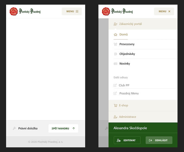
# Mobile Layout
The mobile header and the footer are always the same across all apps within a brand, including the logo. It serves as a unifying element for the customer, including his/hers authentication and profile.
Example of mobile layout for Prazdroj brand:
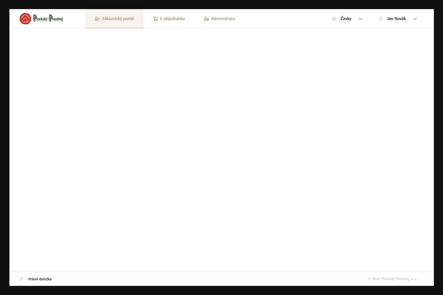
# Desktop Layout
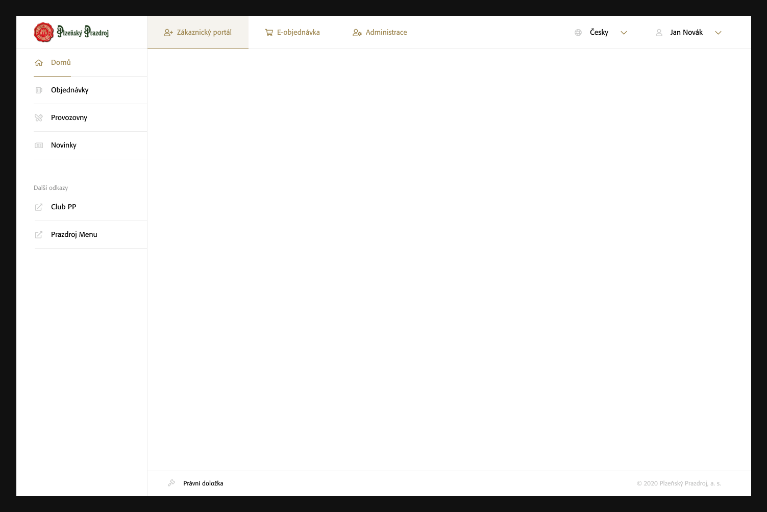
The desktop header is always the same across all apps within a brand, including its content. It serves as a unifying element for the customer, including his authentication and profile.
Desktop Applications
For web applications like customer portal, dashboards and other customer apps where it makes more sense to use side-bar navigation, the layout could look like this:
Desktop Websites
For websites like e-ordering or content based websites we can use top-bar navigation and the layout could look like this: